Project Overview
Green Economy Law is a Toronto-based law firm focused on sustainability, climate tech, psychedelics, and housing. This project aimed to redesign the firm’s website to reflect its values better, improve accessibility, and help users find key information faster. The full process covered research, design, and visual development, resulting in a modern and professional digital presence.


Green Economy Law - Website Redesign
Results
-
A structured website with reduced bounce rates.
-
Clear and accessible layouts that enhance readability.
-
Consistent design system reinforcing the brand’s professional identity.
-
Navigation that makes services and resources easier to locate.
The project has been delivered successfully, and the collaboration continues as new pages and improvements are added over time.
Lessons Learned
-
Strategies to transform complex content into user-friendly layouts.
-
The importance of accessibility in building trust and credibility.
-
How research findings support clear design decisions.
-
Flexibility when working with evolving client needs and platform limitations.
Tools Used
Figma · Card Sorting · Heuristic Evaluation · User Interviews · Adobe Illustrator
Type: Freelance project
Role: UX/UI Designer
Location: Toronto, Canada
Duration: April–July 2025
Background & Problem
The original website contained valuable content but lacked usability. Dense legal text, inconsistent styles, and unclear navigation caused many visitors to leave after viewing only the homepage. A fresh design was required to present the content in a clearer, more engaging, and accessible way.
Process
Research & Key Insights
A heuristic evaluation, user interviews, and card sorting revealed several issues:
-
Content overload made key information hard to scan.
-
Inconsistent styles created an unpolished experience.
-
Accessibility challenges reduced usability for some users.
-
Navigation varied across pages, confusing visitors.
-
Supportive elements like FAQs or glossaries were missing.
These insights shaped the priorities for redesign: simplify, structure, and guide users more effectively.
Project Goals
-
Create a clean, engaging design aligned with the firm’s mission.
-
Improve navigation and information structure.
-
Simplify text-heavy content for better readability.
-
Ensure accessibility across devices and user needs.
Define
Main user journeys were mapped for audiences such as founders, nonprofit directors, and housing advocates. Content was reorganized using the LATCH principle (Location, Alphabet, Time, Category, Hierarchy), creating a logical and consistent structure that improved scanability.
Ideation & Design
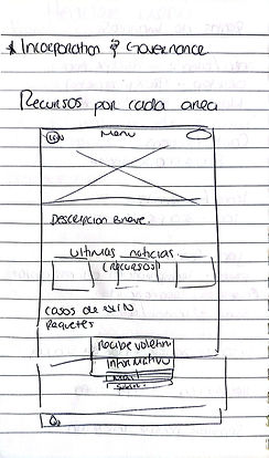
Low-fidelity wireframes explored layout options, followed by high-fidelity mockups in Figma. The updated style guide emphasized:
-
Strong visual hierarchy with whitespace.
-
Accessible typography and contrast-aware colors.
-
Consistent button styles and interaction feedback.
-
Clear placement of CTAs like Book a Consultation.


Testing & Iteration
During prototype reviews, users struggled to scan long text blocks and skipped important sections. The design was iterated by breaking content into shorter paragraphs, adding clear headings, and reorganizing navigation. Feedback also showed that users wanted quicker access to booking a consultation, so CTAs were placed more prominently across the site. These updates improved readability and guided users toward key actions.


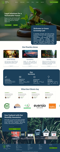
UI Design
The final design delivered a modern, responsive, and accessible interface. It balances professionalism with innovation, reflecting Green Economy Law’s identity while improving overall usability.

Implementation Note
The client chose to implement the redesign on Squarespace and made independent adjustments before launch. While the published site looks different from the original design concept, this reflects the reality of freelance projects, where collaboration and adaptation are key. The design process documented here highlights a user-centered approach, while the final delivery shows flexibility in aligning with client preferences and technical constraints.
Before

Design

Final
