


Hawker – Online Ordering System
Project Overview
Hawker is a small local restaurant offering natural, plant-based dishes. For this project, our team of four UX Designers created a user-friendly online ordering system for both web and mobile. We worked through the complete process. From research to high-fidelity prototyping, focused on usability, accessibility, and clear information design.
Client: Information Architecture Course - Ramy Saboungui
Type: Team Project – Humber Polytechnic
Role: UX/UI Designer
Location: Toronto, Canada
Duration: March–April 2025
Outcomes
The final prototype delivered:
-
A visual menu with filters, descriptions, and images.
-
Easy customization and fast checkout.
-
A responsive layout for both guests and registered users.
-
Real-time order updates and clear confirmations.
Tools Used
Figma · Paper Prototypes · Wireflows · Peer Testing · Collaborative Design
Lessons Learned
-
Iterating user flows across platforms improved efficiency.
-
Early paper prototypes saved time and highlighted usability issues.
-
Testing showed the importance of category clarity and customization options.
-
Collaboration was key: I contributed to user flows and prototyping, while teammates brought strong visual design and testing insights. Recognizing each other’s strengths kept the project moving smoothly.
Background & Problem
Hawker did not have an online ordering system, making it harder for customers such as professionals, students, and vegan consumers to order conveniently. This project aimed to close that gap with a responsive, easy-to-use solution.
Project Goals
-
Build a digital menu with clear descriptions and visuals.
-
Allow easy customization, selection, and checkout.
-
Provide real-time order status updates.
-
Design an accessible, responsive experience across devices.
Process
Research & Planning
We identified the target users and analyzed their needs, referencing Jakob’s Law to apply familiar patterns from popular delivery apps. Together, we mapped flows for both mobile and desktop to ensure smooth navigation.


Ideation & Wireflows
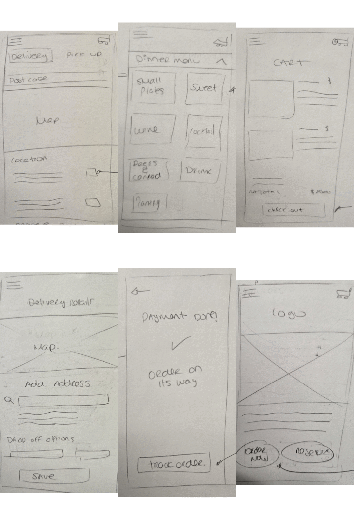
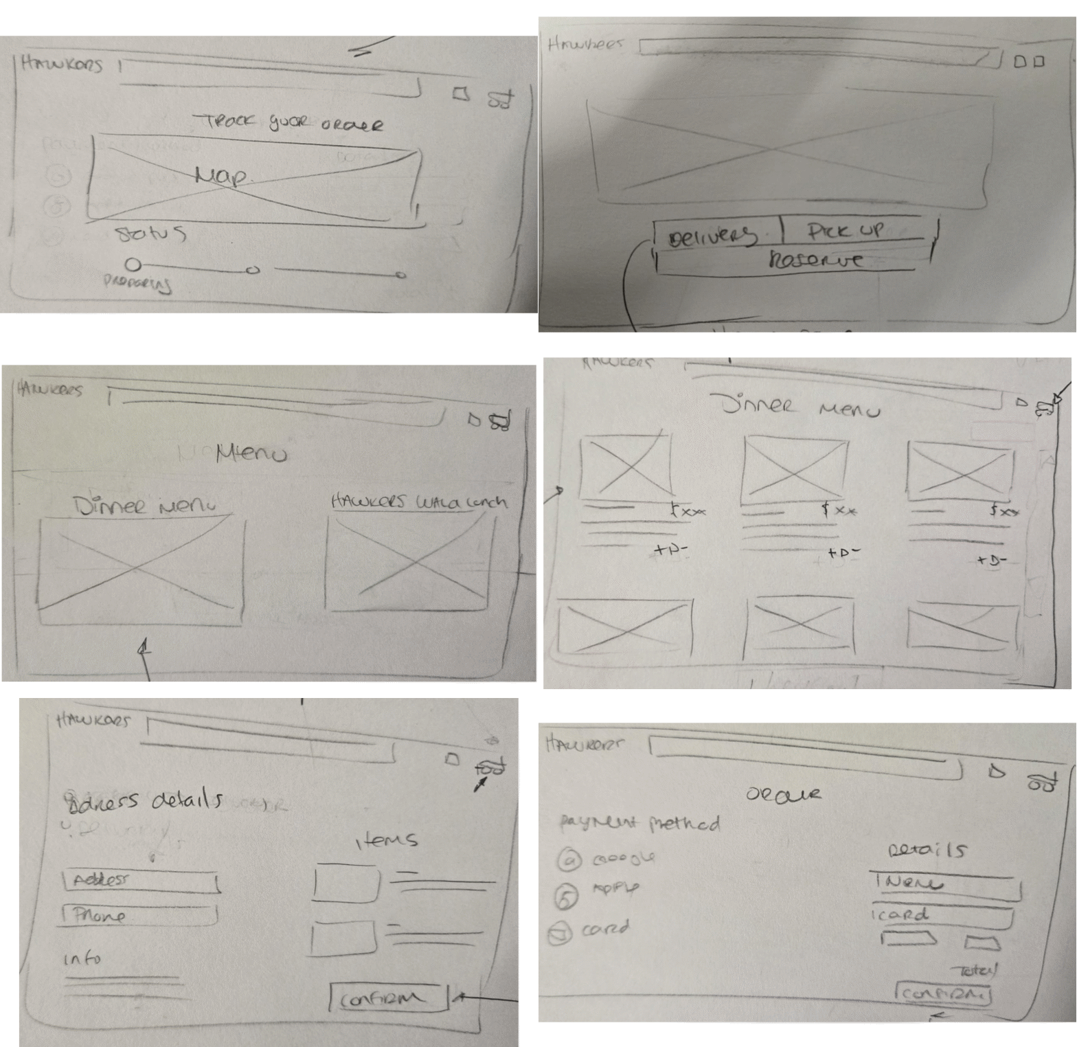
Each team member sketched ideas and built quick paper prototypes to test layouts. This helped us learn early what worked and what didn’t. For example, initial flows had too many steps in the checkout, so we simplified them after feedback.
Medium-Fidelity & Testing
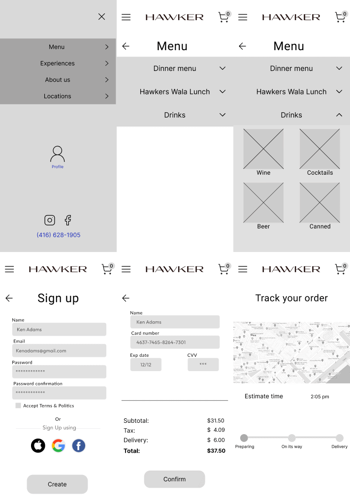
Wireframes were created and tested with peers. Feedback showed that the menu needed clearer item categories and that users wanted customization options to be more visible. We iterated several times, adjusting layout and labels to improve clarity.
High-Fidelity Design
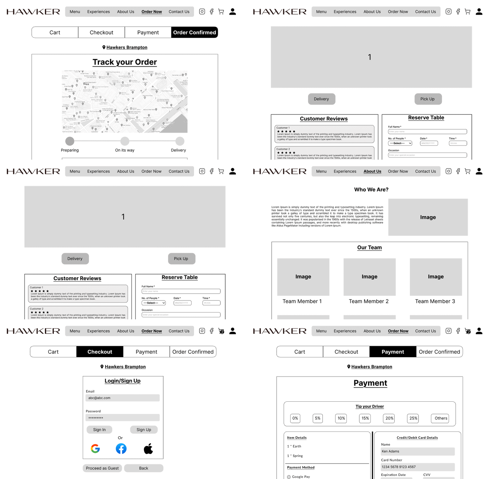
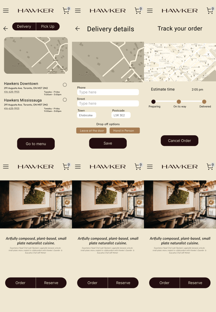
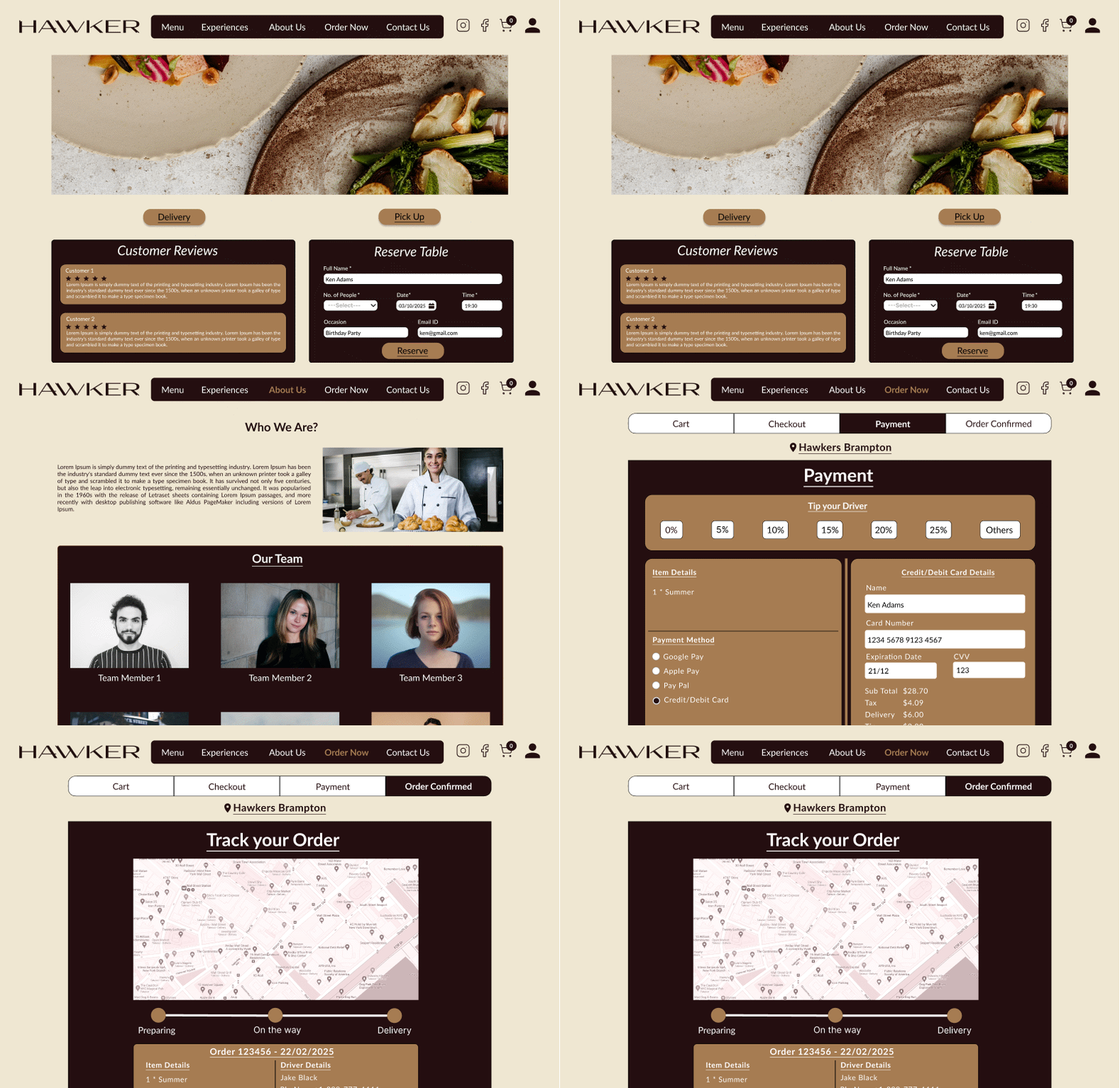
We designed a clean, consistent UI in Figma, balancing Hawker’s brand with usability. The final prototype included mobile and desktop versions, with a streamlined flow from browsing to checkout.


Testing & Iteration
Medium-fidelity wireframes were tested with peers. Users mentioned that the checkout flow felt too long and some buttons were not clear. Based on this, the number of steps was reduced, button labels were simplified, and visual cues were added for order progress. These changes made the final flow faster and easier to understand.