Client: Interaction Design Course - Siddiqah Gulamhusein
Type: Academic Project
Role: UX/UI Designer
Duration: April 2025
Location: Toronto, Canada
Toronto Cupcakes – Navigation & Header Redesign

Project Overview
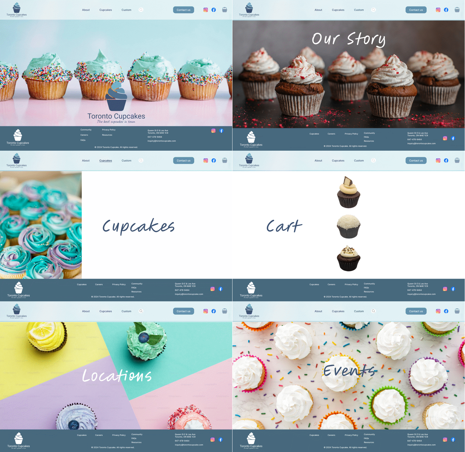
Toronto Cupcakes is a local bakery known for its colorful, custom cupcakes. This academic project focused on improving the website’s navigation structure and visual identity. The original site had a cluttered header, hard-to-find information, and an inconsistent style. The redesign simplified the navigation, refreshed the header layout, and introduced a new logo and color palette that better reflect the brand’s playful yet elegant personality.
Outcomes
-
A simplified menu that makes key actions easy to find.
-
A refreshed logo and visual system that strengthen brand identity.
-
A cleaner, more usable header layout with stronger hierarchy.
-
A consistent look and feel that aligns the website with the product’s personality.
Tools Used
Figma · Card Sorting · Wireframing · Branding
Lessons Learned
This project highlighted how small but strategic changes in branding and UX structure can transform the overall experience. Clear navigation, consistent visuals, and accessible layouts make a site more professional, usable, and emotionally connected to its product.
Project Goals
-
Reorganize the navigation and improve hierarchy.
-
Create a clean and accessible header layout.
-
Highlight key actions such as Order Now and Contact.
-
Redesign the logo and define a cohesive visual system.
-
Align the UI with the brand’s tone: playful but elegant.
Process
Card Sorting
Open card sorting helped identify how users group information such as flavors, delivery, and location. Insights from this exercise informed a simplified and more intuitive menu structure.

Header and Footer Redesign
With the new brand system in place, the full header was restructured:
-
A streamlined layout with simplified navigation.
-
Clear call-to-actions that guide users.
-
Stronger brand presence through color, shape, and typography.

Header

Footer

Visual Identity Refresh
A custom logo was designed and paired with a pastel-based color palette balanced by high contrast for legibility. Typography, spacing, and consistent visual rules created a stronger and more cohesive brand identity.

Wireframes & UI Design
Multiple layouts were tested through wireframes, followed by high-fidelity mockups in Figma. The final design included a sticky header and footer, a visible “Contact Us” button, and consistent branded elements across the interface.


Testing & Iteration
Wireframes were tested with classmates through open card sorting and quick prototype checks. Users found the “Order Now” option was buried and some menu labels were unclear. The header was restructured with a sticky navigation, simplified categories, and a bold CTA button. Iterations focused on visual hierarchy and clarity, resulting in a more intuitive and playful interface aligned with the brand.